NoRush
Mobile App Design

Problem: long concession queues make moviegoers miss the start of the film.
What I did: the full design thinking process, an 18-screen prototype and a usability study.
Outcome: usability testing surfaced 9 themes. 3 are visible in the final screens, 3 are partial or unclear, and 3 are next steps.
NoRush is a mobile app concept for pre-ordering snacks at the cinema. Moviegoers pick their cinema, browse the menu, customise their order and pay on their phone, then collect it or have it delivered to their seat without queuing before the film starts.
Role:
UX/UI Designer
Year:
2025


Explore the full story –
Challenge
Long concession lines leave moviegoers rushed and often missing the start of the film. Research pointed to busy professionals and parents who arrive just before showtime and want a faster, calmer way to get their snacks.
Objective
Design an end-to-end ordering flow that stays quick in a busy lobby: choose the cinema, browse snacks, customise items, check out with card, MB WAY or Apple Pay, and track the order until pickup or delivery to the seat.
Results
A usability study, synthesised in an affinity map, surfaced nine themes. People found the ordering flow easy, but wanted clearer tracking, a deals category, allergen information and their door and seat number at hand after ordering. Three themes are visible in the final screens (tracking, deals, door and seat), and three are next steps (separate times for hot food, a delivery-or-collect suggestion when running late, and less weight on receipt sharing). The tests were qualitative and I didn't record numbers.
Key insight
People don't mind paying for snacks. They mind missing the start of the film while they queue for them.



Process
A full design thinking process, documented step by step in Figma.
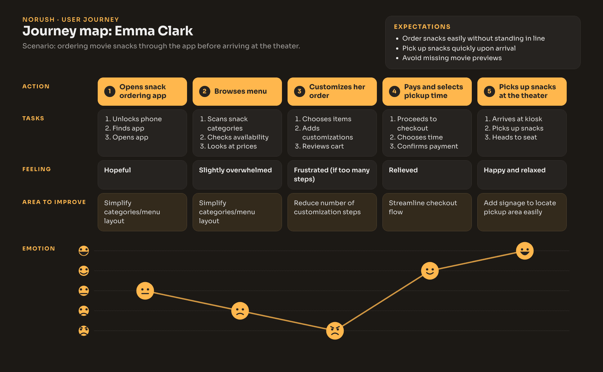
Empathise. Research on moviegoers who arrive just before showtime, an empathy map, a persona and a user journey map.
Define. Problem statement, the 5 Ws, a value proposition and the core features.
Ideate. Competitor audit, user flow, storyboard, information architecture and wireframes.
Prototype. Lo-fi, then hi-fi screens and a style guide with the Sora typeface, a warm amber accent and reusable components.
Test. A usability study, synthesised in an affinity map: nine themes, each with a recommendation, then checked one by one against the final screens.


Success metrics
The usability tests were qualitative and I didn't record numbers, so there are no results to show here. These are the targets I would track if NoRush launched:
From opening the app to a paid order in under two minutes.
At least 85% of people who start checkout complete it.
Pickup at the counter in under two minutes after the order is ready.
Shipped & next
In the prototype: 18 screens from choosing the cinema to tracking the order, with collection or delivery to the seat and card, MB WAY or Apple Pay.
Changed after testing: people were unsure how to finish checkout, so I added a clearer call to action and a progress indicator.
Next: separate cooking and delivery times for hot food, a delivery-or-collect suggestion based on showtime, allergen labels in the product view, less weight on receipt sharing, and stronger contrast on the amber buttons.